Web Design is 95% Typography
(Oliver Reichenstein, 2006)
Oliver Reichenstein, the founder and director of Information Architects, told us that the key to successful website design is typography because most of the information found on the web is delivered in written form. In 2006, it was true. In 2016, it is even truer. The simple nature of minimalistic design like popular flat design and Google’s material design, typography is becoming more important.
The same principle applies to localized versions. Languages do not only differ in grammatical structure and sounds, but also in length, size, design, and readability. Localization of text affects the design, so design should be localized.
In this article, I will describe the aesthetics of Japanese typography and the best practices of Japanese web typography. This will help you reach your Japanese audience more effectively.
Anatomy of Japanese Web Typography
It’s Complicated
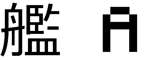
Japanese kanji characters use more pixels than alphanumeric characters because they consist of many strokes. For example, the alphabet character “A” only needs 7 x 7 pixels, but the kanji character “艦” requires 15 x 15 pixels for it to be readable.
Fundamental Size Differences
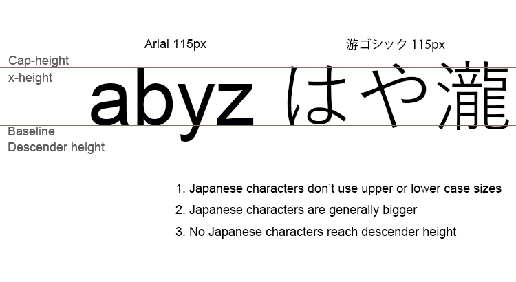
Typography in English has parameters called cap-height, x-height, baseline and descender height. It also has upper case letters and lower case letters. The Japanese language uses none of these variables. All characters are roughly the same size as English capital letters, and many characters end up bigger than alphanumeric characters even when the font size remains the same. Due to height and complexity, Japanese web localization often requires slightly bigger font sizes, wider letter spacing, and line height.
Tip: To avoid low legibility, I recommend a minimum of 12 px font size, 150% line height, and 0.05 em letter spacing for body paragraphs. Of course, these vary depending on font family.
Alignment and Fixed Pitch
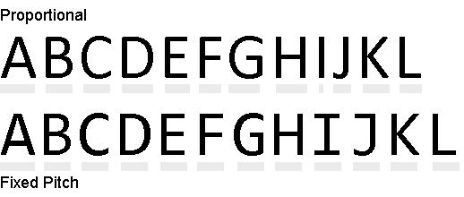
Fonts in which different characters have different widths (pitches) are called “proportional pitch” fonts. On the other hand, fonts in which different characters have same widths are called “fixed pitch” or “monospace” fonts. The Japanese language does not have extremely thin characters like upper case “I” or lower case “l”.
Tip: Proportional pitch fonts are better suited to mobile or UI elements, and fixed pitch fonts are better suited for header or body copy. Don’t forget to set the font family for each design element.
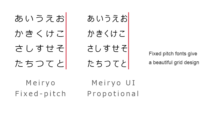
Because the Japanese language does not have spaces, the space between text is always the same and needs no hyphenation.
Tip: Change the text alignment to justified so you can enjoy a beautiful grid design.
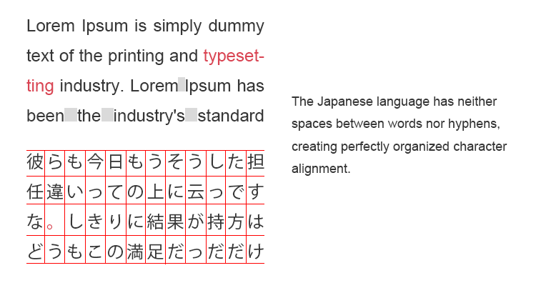
Line Length
line length matters. Typographers adjust line length to aid legibility or copy fit. Generally, for printed text it is widely accepted that line length fall between 45-75 characters per line (cpl). However, it’s different in Japanese.
In Japanese, best line length is
- 20-38 cpl for vertical line on DTP
- 15-35 cpl for horizonal line on DTP
- 15-40 cpl for computer display
- 15-21 cpl for smart phone display
It’s less than half of optimal line length in English.
Gothic or Mincho?
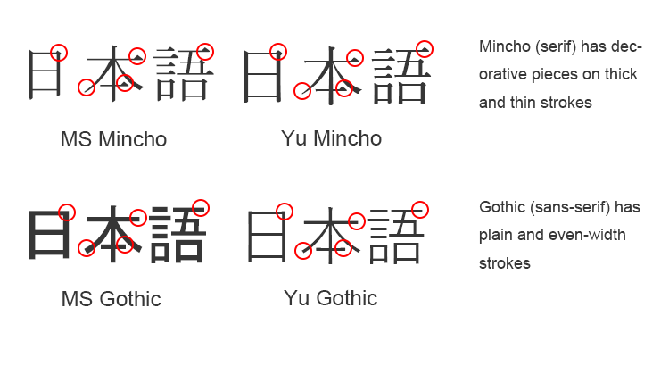
Serif and Sans-Serif — the very first words you learn in typography. In Japanese, Serif is called “Mincho” (明朝) and Sans-Serif is called “Gothic” (ゴシック). The Mincho font was first used in 15th century China, during the Ming Dynasty, as a typeface for woodblock printing. The Gothic font first appeared in Japan around the 18th or 19th century. According to a typeface designer Toshi Omagari, Gothic was invented based on Blackletter (also known as Gothic script). However, nobody knows for sure
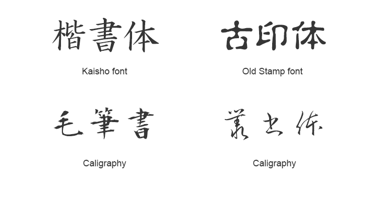
Mincho-category fonts have characters with triangular decorative elements at the ends of horizontal lines and have lines of varying thickness. Gothic-category font characters, on the other hand, have minimal decorative elements and have uniform line thickness. Other font categories also exist, including cursive/script (Sosho), Kaisho, Reisho, comic, and handwritten. Mincho and Gothic category fonts are often used in DTP and graphic design (e.g., a website banner image). There are many fonts with many purposes, but we’re focusing on those with the most presence in terms of web text. Don’t worry, I’ll address other, unique font uses in another article.
The Best Font for Japanese
Unfortunately, there is no such thing as the best Japanese font; there is only the best font choice based on your individual priorities, including compatibility, legibility, aesthetics, usability, price, and brand identity.
Open Sans
Best for: website body paragraphs (like this blog!)
Worst for: contracts
Times New Roman
Best for: newspapers
Worst for: websites geared towards children
This same principle applies to website localization. It’s not always easy for even an experienced designer to make the right font choice in a different language. There are so many available fonts to choose from, it can be overwhelming. This is one of the many functions of a localization expert.
Let’s compare some the most popular Japanese fonts:
| PRICE | USABILITY | COMPATIBILITY | AESTHETIC | |
|---|---|---|---|---|
| Google Noto Sans CJK | Free | ★★★★★ | ★★★ | ★★★★ |
| Hiragakino Gothic | 250 USD | ★★★★ | ★★★ | ★★★★★ |
| Hiragino Mincho | 250 USD | ★★★★★ | ★★★ | ★★★★★ |
| Yu Gothic | Free | ★★★★ | ★★★★ | ★★★★ |
| Yu Mincho | Free | ★★★★ | ★★★★ | ★★★★ |
| Meiryo | Free | ★★★ | ★★★★★★ | ★★★ |
| IPA fonts | Free | ★★★ | ★★ | ★★★★ |
| MS Gothic | Free | ★★★ | ★★★★★ | ★★ |
| MS Mincho | Free | ★ | ★★★★★ | ★ |
* Usability: Usability for designers. Fonts with various weights have higher usability.
* Comparability: Compatibility with browsers. When fonts have higher comparability, the font has been pre-installed on more devices
* Aesthetics: Font beauty and readability, content legibility
Noto Sans CJK JP

Noto Sans CJK JP is a Gothic font developed by Google. It’s like the jeans of the font world: you can dress it up or down. It has 7 font weights, allowing you to use the fonts on many design components. It is more modern than MS Gothic and Meiryo, but not too modern, so you can use it for both traditional and modern design. Overall, it is a very useful font for any occasion.
The only weakness of Noto Sans CJK JP is compatibility. It is not pre-installed on computers, so that can slow down page loading speed.
Hiragino Kaku Gothic Pro

Hiragino Gothic is my favorite Gothic font. It’s like Helvetica in Japanese. It has an amazing 9 font weights and has both beautiful proportional pitch and fixed pitch alphanumeric characters. This is one of the biggest features because it is nearly impossible to find Japanese fonts with beautiful alphanumeric characters.
Hiragino is also relatively compatible. It’s installed on all Mac computers. Its only weaknesses are that it’s not installed on Windows computers and it’s quite expensive.
Hiragino Mincho

Hiragino Mincho is a one-of-a-kind font that has both sharp, modern beauty and classy, traditional beauty. It’s the little black dress of typography. It can be used for both official documents and casual blogs.
Mincho fonts tend to be dark and heavy, but Hiragino Mincho has a light, elegant and bright impression. It’s a font loved by all kinds of people, young and old, and can be used for any target audience. It comes with 7 weights that make the font useful for many design components, from the massive heading text of landing pages to body paragraphs.
Yu Gothic

Yu Gothic is installed on Windows 8.1 and later and Mac OS 10.9 and later. This makes Yu Gothic the second most compatible font currently available. Meiryo is still the number one font in terms of compatibility because it’s also installed on Windows 7. I believe Yu Gohic will replace Meiryo in the very near future.
Meiryo has a very modern design that may give too casual an impression if you use it in a business email. On the other hand, Yu Gothic can be used in both formal and informal documents. It has 5 weights that allow you use the font in both heading and body.
Yu Mincho

Yu Mincho is installed on Windows 8.1 and later and Mac OS 10.9 and later. Mac users have been blessed with their beautiful Hiragino Mincho font for years, but Windows users have suffered from the absence of the beautiful and readable Mincho font before Yu Mincho and IPA fonts.
The design concept of Yu Mincho is the font for Japanese history novels. This modern font with traditional tastes lets you use the it in both formal and informal documents. It has 4 font weights.
Meiryo

Meiryo means “clear to read”. It is indeed easier to read over other fonts, which makes it the most popular choice for many web designers. While it is not particularly beautiful, it does not share the same strong characteristics as other fonts, making it one of the best fonts for paragraphs.
Meiryo is installed on all Windows computers (7 or later) so that users’ browsers don’t need to load a 1 or 2 MB font file.
MS Gothic

MS Gothic is one of the most compatible fonts. It is the default sans-serif font of most older Windows computers and many browsers. However, it’s neither very beautiful nor particularly legible. After Meiryo was introduced with Windows 7, MS Gothic lost its usefulness. MS Gothic is not anti-aliased when the font size is smaller than 16 pt, so Windows renders bitmap characters.
MS Mincho

MS Mincho is also one of the most compatible fonts and is the default serif font of Windows computers running XP and older and many browsers. It’s ugly and illegible. I do NOT recommend that anybody use it unless your target audience is Windows XP or 7 users with very slow internet.
Tip: When Japanese is not set in a style sheet, most browsers will render Japanese characters as MS Mincho. Be careful that you don’t end up with an ugly localized website like this.
Web safe font stack in Japanese
47% of consumers expect a web page to load in 2 seconds or less. (How Loading Time Affects Your Bottom Line)
Page loading speed is an important element of front-end development. In English, typography has very small impact to page loading speed because file size of font is usually less than 500KB. However, in Japanese, it can be a major cause of a slow-loading page.
Japanese font files have double-digit hiragana, both single-digit and double-digit katakana, both single-digit and double-digit alphanumeric characters, many symbols, and from 2,000 to 12,000 kanji characters. Some font files have more than 300,000 characters in total and the file size can be bigger than 2MB.
It is safer to use okay-looking, pre-installed fonts in lieu of using and having to upload beautiful fonts. Web-safe fonts are fonts that are pre-installed to many devices. While not all devices have the same fonts installed, you can choose several fonts that look similar, and that are installed on different devices. Here is a web-safe font stack in Japanese that I have crafted:
font-family : 'ヒラギノ角ゴ ProN' , 'Hiragino Kaku Gothic ProN' , '游ゴシック' , '游ゴシック体' , YuGothic , 'Yu Gothic' , 'メイリオ' , Meiryo , 'MS ゴシック' , 'MS Gothic' , HiraKakuProN-W3 , 'TakaoExゴシック' , TakaoExGothic , 'MotoyaLCedar' , 'Droid Sans Japanese' , sans-serif;
* “ヒラギノ角ゴ ProN” and “Hiragino Kaku Gothic ProN” are the same font, but some devices or browsers cannot understand when it’s written in Japanese or English, so it’s better to write it in both languages. The same applies to Meiryo and Ms Gothic TakaoEx Gothic.
Font stack of pre-installed fixed pitch Mincho fonts
font-family : 'ヒラギノ明朝 ProN' , 'Hiragino Mincho ProN' , '游明朝','游明朝体',YuMincho,'Yu Mincho' , 'MS 明朝' , 'MS Mincho' , HiraMinProN-W3 , 'TakaoEx明朝' , TakaoExMincho , 'MotoyaLCedar' , 'Droid Sans Japanese' , serif;
Pre-installed fixed pitch fonts of each device
| Gothic | Mincho | |
|---|---|---|
| Windows XP | MS Gothic | MS Mincho |
| Windows 7 | Meiryo MS Gothic |
MS Mincho |
| Windows 8.1 | Meiryo MS Gothic Yu Gothic |
MS Mincho Yu Mincho |
| MacOS X 10.4 | Hiragino kaku Gothic Pro | Hiragino Mincho Pro |
| MacOS X 10.5 | Hiragino kaku Gothic Pro Hiragino kaku Gothic Pro N |
Hiragino Mincho Pro Hiragino Mincho Pro N |
| Mac OS X 10.9 | Yu Gothic Hiragino kaku Gothic Pro Hiragino kaku Gothic Pro N |
Yu MinchoHiragino Mincho Pro Hiragino Mincho Pro N |
| iOS | HiraKakuProN-W3 | HiraMinProN-W3 |
| Android | Droid Sans Japanese | – |
| Ubuntu | TakaoExGothic Takao Gothic |
TakaoEx Mincho Takao Mincho |
A big part of the information on websites is delivered in the text rather than in graphics. It’s only natural to pursue quality web typography localization as well as text translation.
If your localized website has a high bounce rate, short duration, and low conversion rate, you might check your typography.

[…] Basically assign them tasks that require linguistic and cultural understanding, and assign yourself tasks that require more hard skills. For example, I cannot design websites or code websites because I have only basic knowledge of PHP and Photoshop, but I have studied web design and have seen enough websites to tell when a website looks good or bad. So I could talk to your design team, and give them some advice, like what is written on Guide to Web Typography in Japanese. […]
Thank you very much ! That’s amazing information.
I’ve been looking for a comprehensive article on Japanese fonts for years.
I still can’t make my mind if I should import a font or use web safe fonts only.
I’m quite an optimization maniac, and our website is already very heavy due to very advanced customization modules, so I’m puzzled… But I think I’m going to give a try to Google Noto Sans CJK for long texts and give a try to your web-safe recommendation for headings and menus.
I’ll switch our 2 Japanese sites to this later this week.
Thanks again.
Hey @Jordy, curious how it went for you? Can you share any feedback on how it went?
I downloaded Noto Sans JP and it’s looking like each weight is pretty hefty (2mb each?), seeing as I need three weights (6mb…probably too heavy).
Have you employed any loading strategies that help reduce this in practice? I was reading this article on google, talking most about Latin, but (not speaking any Japanese myself), I was wondering if there may be some “preloading of a subset” strategy that could work to help render the page and what is needed faster (whilst the rest of the fonts download)?
The article is here, specifically relating to Google Fonts.
https://developers.google.com/web/fundamentals/performance/optimizing-content-efficiency/webfont-optimization#optimizing_loading_and_rendering
Any insights would be much appreciated.
I am struggling with this as well and would be very interested in finding out if anybody has found a useful strategy for this problem.
[…] Read more: The Most Comprehensive Guide to Web Typography in Japanese […]
Great Article!
I’m sure it’s just a typo, but the first font stack you list (right before the Fixed Pitch list) includes TakaoEx*. These should really be TakaoP*, since the other fonts in that list aren’t fixed pitch.
This might seem trivial, but it would be great to know where to get additional fonts.
For example, the kaisho font used above – perhaps not for web design, but for other purposes such as posters would be useful.
Great article… It seems that meyrio is not delivered anymore on Windows since W10. Any better recommendation ?
[…] Finding the appropriate font was one of the bigger struggles during the creation of this logo. A bold and san serif font was my first instinct to keep it readable at a distance and so it will scale down nicely. Serif fonts didn’t necessarily scream Japanese to me, probably because most of the sushi logos I saw rarely had a serif font. Also, looking at Japanese calligraphic fonts helped narrow down this search and I came to find the Motoya font that makes of the “BoxPark” in the logo. This san serif font came about in the 18th century in Japan and is known as Gothic script from the research I’ve done (Hayataki, 2018). The “Sushi” text is known as Shojumaru which draws inspiration from a 1957 film called Sayonara. Hayataki, M. (2018, November 28). The Most Comprehensive Guide to Web Typography in Japanese. Retrieved from https://mhdigital.llcweb-typography-in-japanese/#.XXMXqpNKjxs […]
[…] Read more: The Most Comprehensive Guide to Web Typography in Japanese […]
Very helpful article. Thank you very much! — Adrian
p.s. As several people above mentioned: I too am wondering about subsetting Japanese fonts.
In terms of loading Japanese fonts on the web, I can’t see anything that comes to Google fonts for speed. The key is to let Google host the fonts for you. When your site requests the fonts, they send only the glyphs that are actually used, so there’s no need to load the whole font. This takes it down from many MBs to KBs.
To be clear: don’t download the font yourself. Google gives you the right links, e.g.
and then you just need one line of css: font-family: ‘Noto Serif JP’, serif;
Don’t believe me? Try it. Put one Japanese glyph on your page, load the page with the browser inspector > network tab > fonts open, and hard refresh the page. Now add many glyphs to your page and refresh. See?
Disappointing that an article that uses the word ‘comprehensive’ doesn’t pay this any attention.
We use RodinNTLG (by Fontworks/Type-Labo) on our site. For any Latin characters, we use Avenir Next (by Linotype).
RodinNTLG is Rodin, but with New Type Labo Gothic kana. Kanji characters are the same ones as original Rodin. (same goes for RodinNTLG’s Latin characters but our users won’t see them unless a number gets typed full-width for some reason.)